There’s a particular kind of hesitation that happens in front of a jewelry display or an online shop: everything looks lovely, and yet nothing feels obviously yours. If you’ve ever bought a beautiful bracelet that stayed in its pouch because it never quite matched anything you wear, you’re not alone. Learning how to choose crystal colors is less about memorizing rules and more about paying attention to what you already reach for.
Color is the first thing we notice and the last thing we think about. We talk about the meaning of a stone, the weave of a cord, the weight of a pendant, but the reason a piece becomes a daily favorite is usually simpler than that. It sits well against your skin. It plays nicely with the sweater you wear three times a week. It makes you feel like yourself, only slightly more put together.
This guide walks through how to choose crystal colors using four filters that work together: your wardrobe, your personal color palette, your mood, and the season. None of them are strict. Together, they turn a guessing game into a gentle, repeatable decision you can make in a few minutes.
Start With Your Wardrobe, Not the Crystal Shelf
Before you browse a single product page, open your closet. Not the fantasy version of it, the actual rotation of things you wear. The colors you see most often there are the colors your jewelry has to live with, and jewelry that has to be worked around tends to get worn less.
Try this quick inventory. Pull out five pieces you’ve worn in the last two weeks. Lay them side by side and look at the palette that emerges. Most women find it’s narrower than they expected: maybe a lot of cream, denim, olive, and soft black, or a run of blush, camel, and warm white. That palette is your starting point, and it’s a far better guide than any trend list.
- If your closet leans neutral and soft, clear and pale stones will disappear into it beautifully.
- If your closet is mostly dark, deep saturated stones create a quiet, deliberate contrast.
- If you have one signature color you wear constantly, let your jewelry echo it rather than fight it.
- If your closet is genuinely colorful, choose one stone that repeats your favorite hue and keep the rest simple.
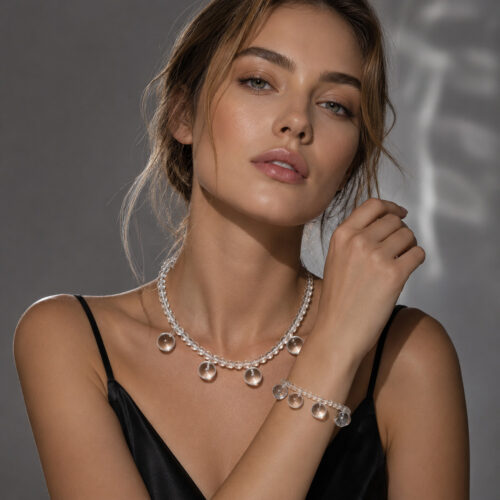
Clear quartz is the most forgiving place to begin, because it reads as light rather than as a color. A piece like the Bubble Cloud Set layers over almost any palette without competing with it, which makes it a useful anchor while you’re still figuring out the rest.
Shop the Sorvara ritual
-
Jewelry Sets
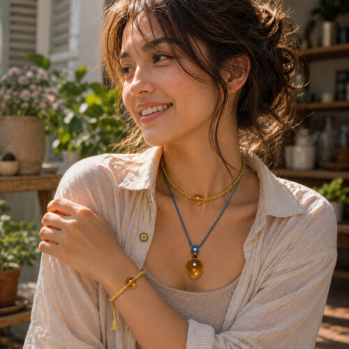
The Golden Triptych Golden Hour Choker + Slow Sunday™ Pendant + Slow Sunday Bracelet
$178.00
Find Your Personal Color Palette in Three Minutes
You don’t need a professional draping session to understand which colors flatter you. You need a mirror, decent daylight, and about three minutes.
Look at your skin, not the stone
Hold a piece near your face and watch what happens to your skin. If it looks even and rested, that color is working with you. If your skin suddenly looks gray, sallow, or shadowed, the color is fighting you, even if you love it on the website. This is the single most reliable test there is, and it costs nothing.
Notice warm versus cool
Warm-toned jewelry tends to sit happily with gold, camel, rust, olive, and cream. Cool-toned jewelry tends to sit happily with silver, denim, charcoal, plum, and true white. Most people can wear both, but one direction usually feels more like home. If you’re not sure, think about which metal you reach for without thinking.
Check your contrast level
If your natural coloring is high contrast, with dark hair and light skin or bright eyes, you can carry stronger, deeper stones without feeling overwhelmed. If your coloring is lower contrast and softer, sheer, pale, or muted stones will often feel more harmonious. Neither is better. They simply ask for different colors.
How to Choose Crystal Colors for Your Mood and the Season
Wardrobe and palette tell you what will look right. Mood and season tell you what will feel right, and the two don’t always agree. That’s fine. Think of mood and season as the reason to own a small range rather than a single signature piece.
Spring and summer: lighter, clearer, cooler
Warm months tend to invite pale, luminous, and watery tones. Clear quartz, soft blush, pale aqua, and sea blue feel at home with linen, cotton, and bare skin. This is the season for lighter layering, a fine choker with a slim bracelet, or a single pendant against a plain neckline. Ocean-toned pieces such as the Shallow Sea bracelet or the The Tide Comes In Still Blue Choker + Shallow Sea Bracelet set were made for this kind of weather and wardrobe.
Autumn and winter: deeper, warmer, richer
Colder months often call for weight and warmth. Deep blues, smoky browns, obsidian black, and violet all feel appropriate against wool, cashmere, and dark outerwear. Jewelry also sits on top of more fabric in winter, so slightly larger or more layered pieces hold their own. The Golden Hour Choker brings a warm, low-light glow to a neutral coat, while Return to Zero pairs naturally with black and charcoal.
Seasonal shifts are also a lovely excuse to rotate rather than accumulate. Packing away summer pieces and bringing out deeper ones in October makes a small collection feel new again without buying anything at all.
What Crystal Colors Are Traditionally Associated With
Many women choose crystal colors for the qualities they’ve long been connected to across different traditions. These associations are symbolic and cultural rather than scientific, and they’re best held lightly, as a reminder you enjoy rather than a promise. What matters most is whether the meaning resonates with you personally.
- Clear and white tones are often chosen for clarity, simplicity, and fresh starts.
- Blush and rose tones are traditionally associated with warmth, softness, and self-kindness.
- Blue and sea tones are often chosen for calm, steadiness, and a sense of space.
- Violet and purple tones are traditionally associated with reflection, intuition, and quiet evening hours.
- Deep black tones such as obsidian are often chosen for grounding and the feeling of starting over.
- Gold and amber tones are traditionally associated with warmth, confidence, and celebration.
If a color’s symbolism speaks to a moment you’re in, a new job, a move, a season of rest, that’s a good enough reason to wear it. A piece like Inner Cosmos can serve as a small daily reminder of whatever you’re working toward, whether or not anyone else ever notices it.
Layering Crystal Colors Without Looking Busy
Once you have two or three colors you love, the next question is how to combine them. The answer is usually restraint.
Use one warm and one cool
A warm gold-toned piece next to a cool blue or violet one creates a pleasant tension without clashing. This is the easiest way to make a layered stack look intentional. The The Golden Triptych already balances warm gold tones within one set, which takes the guesswork out of it.
Repeat one color, vary the size
If you’re layering a necklace and a bracelet, letting them share a single color family reads as coordinated rather than accidental. The The Violet Hours does exactly that, with violet tones carried across a pendant and a bracelet.
Let one piece be the loudest
Choose the piece you want people to notice, then keep everything near it quiet. If a deep blue choker is your focal point, keep the bracelet neutral. The Still Blue Choker is a good example of a single strong color doing all the work.
Choosing Crystal Colors as a Gift
Gifting jewelry by color is easier than gifting by meaning, because you can observe color without asking a single invasive question. Notice what she wears, what her home looks like, what colors show up in her phone case, her water bottle, her car. People are remarkably consistent, and those small signals tell you more than any quiz.
If you’re unsure, choose a soft, symbolic set that leaves room for interpretation. The The Story in Three Parts was designed for exactly this kind of gifting, with tones that suit a wide range of palettes and a structure that feels personal without being presumptuous.
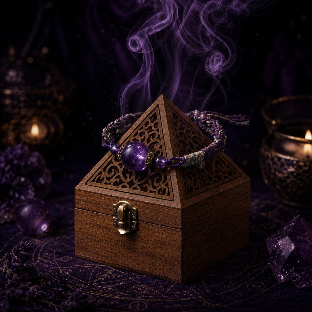
And if you’d rather give her something for her space than her wrist, a quiet home piece works just as well. The Pyramid Pine Wood Incense Burner or the Still Fire ceramic burner both suit someone who thinks in color and atmosphere as much as in accessories.
Making the Color Yours
Choosing a color is only half of it. The other half is the small moment you create around wearing it. A bracelet that goes on with your morning coffee. A pendant you touch before a difficult phone call. Incense lit while you choose the day’s piece. These rituals don’t need to be elaborate, and they don’t need to mean anything to anyone but you.
Start with one color you already know suits you, wear it for a week, and notice how often you reach for it. Then add a second color in a different mood register, something softer or deeper than your usual. Over a few months, you’ll have a small palette that reflects your wardrobe, your season, and your own quiet intentions, which is a far better collection than anything a trend could recommend.
If you’d like a gentle place to start, the Bubble Cloud Necklace works with almost any palette, and the First Blush Choker adds a soft warm note when you want one. Take your time, choose slowly, and let the color choose you back.